MOTHERSHIP
Brand Identity
Menu Design
Environmental Graphics
Signage
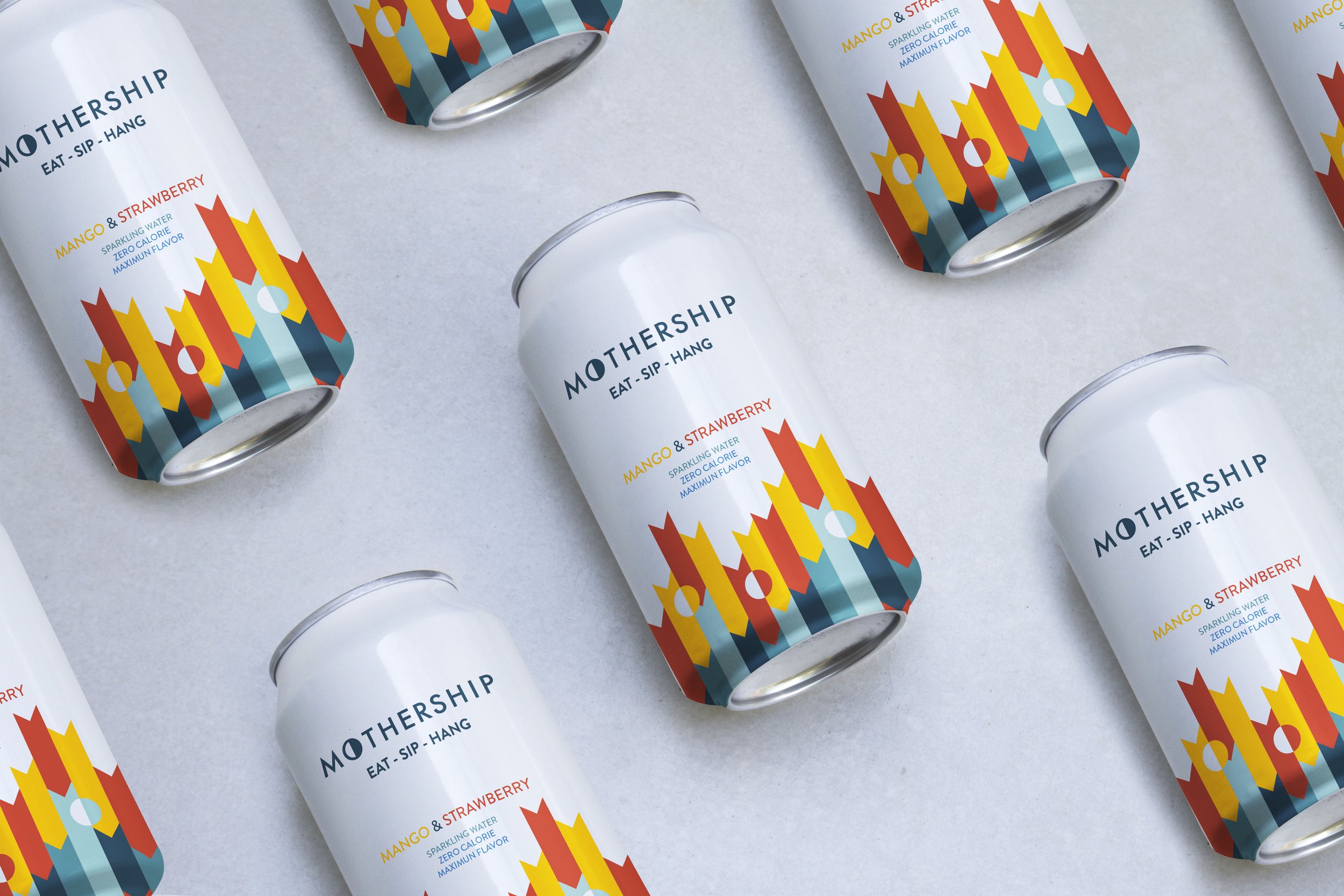
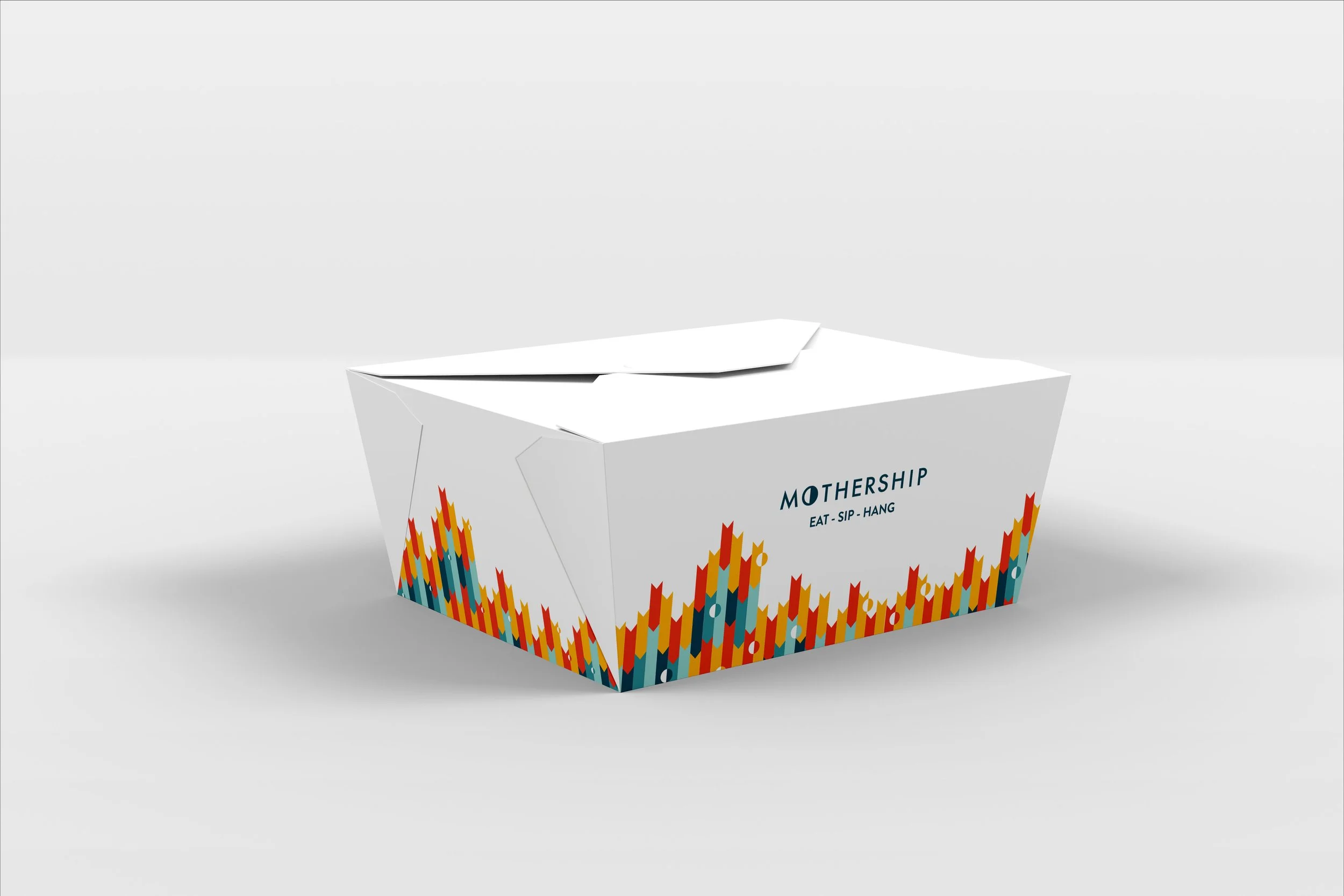
Revival Cafe + Kitchen co-founders Liza Shirazi and chef Steve “Nookie” Postal asked LLM Design to help develop a brand identity for Mothership, their new restaurant in Cambridgepark Drive, that will focus on testing novel food concepts along with a variety of craft beers. They wanted their restaurant brand to be casual and playful, but still modern and clean. Not over designed. Classic, but open to pushing limits.
Inevitably, the word “mothership” leads people to thoughts of outer space. While this isn’t the main concept of our design, we give a nod to the celestial realm through a half-moon icon within the “o” of the graphic mark. This lunar shape also serves to represent Mothership as a cyclical space where people come to restart, regenerate – and complete their days. The Futura font, with is modern sharpness and metro vibe, relates to the Cambridge community, an audience with both urban and rural sides.


